
So evidently it was just another small trap...
But let's look at the situation once again.
Now it looks more like, what we have seen, is Granvilles "Rally that fools the majority".
And we are getting the clues mostly from Nasdaq not SPX.
So lets look at a Nasdaq chart.
These are charts I sent to my subscribers last Sunday and yesterday (it's in swedish and I don't have a translation)
We are testing the neckline of the gigantic H&S pattern of the 2007 top - that's tough resistance.
It's also the 50% pullback of the 07-09 bearmarket - that's also tough resistance.
And look at the wedge - to break the upside of that one you would have to have a verttical upmove. but you won't get that due to the resistance, so we have to go the other way - down.
The time factor is extremly interesting, and here the trick is not to use any of the bottoms, but the top in the middle (there are two explanations for that - one I will tell you here: Michael Jenkins writes a lot about foldback and how they develop in the market. This is one. The "real" "bottom" in this chart is marked by "2". If you make an imaginary fold down of it between bottom 1 and 3 you have the "real" bottom. And that is the one you use for your time study.
Connect that "bottom 2 with the 2007 top and you av a perfect cycle.
Now - if you compare the bearmarket with this upmove using that "bottom" we find that the upmove is 50% of the down move in TIME.
And above we showed the it is also 50% in PRICE.
A perfect Gann squaring and a strong indication of a top in the 2007-2009 perspektive.
My thought is therefor that the comming downmove will not be a correction the neckline of the H&S formations we see floating around. Much lower.
But more on that below.

Actually SPX shows some fine arguments for a top as well. Even if I regard this as a chart showing how orderly the market is, it dosn't show the potential - just that we can expect a top. The perfect fib spiral, however, might do that. The warning lines inside the fork are 38,2 and 61,8 lines.

While we are on the 50/50 subject THIS is extremly iteresting and we are focusing on a similar "coincident". I am not shure if yuore familiar with the number 666 issue
This is what Bryce gilmore writes in his book "Geometry of Markets"
666, is the solar number and the number of the beast
1746 is the number of fusion (1080 (lunar number)+666). Where 666=0,382 och 1080=0,618 (1080= radius of the moon in miles) These numbers should be treated with respect! .
So who is he? http://www.bryce-gil....com/bgmain.htm
There is more to these numbers, but let's just treat 666 with respect in this post.
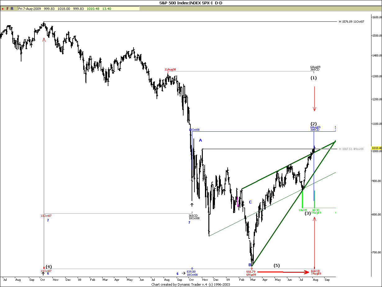
The SPX low was 666.
Now, in Calendar days from the 2007 high to the Aug 7 high, we have , you know what? - 666 calendar days.
Again we have a pefect squaring - to the DAY!
From the same high to the October 2009 low - first crash low - its 365 days (a year) and from THAT low to Aug 6 high there are 300 calendar days10*30 (or 5*60). Trends or top to top, bottom to bottom often lasts 30/60/90/180/360days or a division of 30.
August 8 2008 to Aug 6 is 360 days - a full circle.
The Aug 7 2009, seems to be connected to most important topps bottoms between the top 2007 and now.
This is probably a VERY important top, that will not be broken soon.

Let me show you the swedish OMX index - a perfect Fibonacci spiral ends in Aug 4 and thats where the neckline of the gigantic H&S pattern resists.
So it's not only in the States we see these things.

Same thing in for example Hang seng - just in a different way - as usual.

Check out this BSE chart (india) - first a break out failure of a bottom H&S pattern and then today breakdown through the main support line.

Why top now?
Well, let's do a simple cycle study using Timing solution (Sergej Tarasovs incredible software)
Again, we are not using the top for the TIME study, but the "foldback"top. We are pinpointing where Sun is at, in the Zodiac, when we have the foldback top, in time, and project into the future 360 degrees (when the sun is back at the same point) (which is also a top) and then 360+180 (xactly opposite the first point), which is also a top. and then 360x2 which is our Aug top. So here again we have indications of an important top.
So let's look at some more cosmic stuff
Between Aug 10 and Aug 20 we have 6 different planetary aspects that Ray Merriman in his studies has calculated beeing the most notorious, ious when it comes to being involvet in trend changes of long cycles. The aspectd have a correltaion of between 63% and 74 % to longer term tops. The one tomorrow for instance Mars Square Uranus has a correltaion of 74 % and that's only ONE planet pair - we have SIX aspects in this time span. this is serious stuff - Combine it with what we have seen earlier in this post and just wonder what makes this stockmarket move....

OK back on the ground; Sergej made a cycle analysis using two hundred years of data, applied tgo the Juglar and kitchen cycle.

Then he added them and got this chart.

Then he appliet subcycles to the core cycles and got this chart. The September top is very interesting - considering 200 years of data, I think August fits very well for a long term top, especially since we have allt These long term aspects.

So I did a study myself, using the turbo cycle function. In an instant the software calculates the 5 most prominent cycles using advanced matt an fourier analysis.
This is what I got!
And this has nothing to do with the astro stuff.
It is indicating a down move down into 2010

Before we look at the last chart- take a look at this one. We are looking at a fib time study and a parabola study.
I have not seen many parabola studies, so it's kind of unchartered territory so far.
But if we believe what we see, there are three different trends in this chart 1- long -2 medium and 3 short.
We have left the medium trend for a while, but the question is if we will follow the blue trend down for a test of the medium trend . I would not have thought it would, under other circumstances, with with this top - and October closing in on us - who knows...
The parabola study is mostly for fun - but the fib is more serious.
The histogram below the chart is a count of fib clusters. The higher the bars, the more probable is a trendchange.
Check out the dates (the dates are very close to my astro energy priods))
And then we go to the last chart

Timing solution has a "slicing" function - you can take a slice of any part of a dispayed chart and compare it to another part of the chart.
what I did her was to take a slice of the Dow index from the crash bottom 1929 and 7 months into the future - we got to include the pullback from the crash.
What is interesting here is the TIME factor of the red line (1929)
Not only did it top out at the same time as 2009 but look at the turningpoints - they are at astro and fib turningpoints projected from the present situation and development in the indexes.

The blue square is the part we are looking at. Time is correct but not price -in 1929 the pullback was 61,8% and in 2009 it's only 38,2% - in other words a weaker development now than in pullback in the scary 1929...)


 Very Impressive!!