

Special Note: I was saddened this week to hear of the passing of Kennedy Gammage. Ken was a market friend and colleague for the past three decades. He was always charming and articulate and uncommonly knowledgeable in the ways of the market. I have scoured my memory bank since I heard of his passing and tried to remember back to the early days in Los Angeles, the days of KWHY, the nations first financial television station. Those were the days back in the early 1970s when Gene Morgan presented a full half-hour of technical market analysis at the end of each market day. Those were also the days when my passion for cycles in the market was germinating. As I thought about those days, I realized that Ken used to appear often on the Gene Morgan show, and from time to time he would have a friend on who did cycle projection analysis. It was then it occurred to me that it was my first exposure to the updated Hurst technique of cycle projection analysis, an exposure that was about to change the course of my life. Indeed, there were other contributing factors, but it was then I realized what an important part of my life Ken had affected. I had already been studying the work of Hurst, but there had been some updates on the Hurst projection techniques that were presented on those Gene Morgan shows that began a fire of passion in my life that has never since subsided. I thank Ken Gammage who was responsible, at least in a peripheral way, for nurturing that fire. I also thank him for his market wisdom and his genial, charming, and gentlemanly ways. He will be sorely missed. As my Orthodox Christian faith would proclaim, May his memory be eternal.
THE CYCLES
The inspiration for our front-page chart came from one of our daily updates in late April 2005. That same update inspired the chart on the front page of our May 6th, 2005 newsletter. Here is the quote from that update for Thursday,
April 28th, 2005:
We spent more time than usual this afternoon pondering the markets position in respect to time cycles. The stock market registered an important low on March 12th, 2003. If you add 178 trading days to that date, you get November 21st, 2003, another important market low. If you then move out 176 trading days, it takes you to August 6th, 2004, or 181 trading days which would take you to a double bottom on August 13th, 2004. The average of those two patterns is 178.5 trading days. Those two patterns alert us to the possibility of another cycle resolution around 178-179 trading days from August 13th, 2004. Today marked the 178th trading day since that date. That alerts us to the possibility of some kind of turn in this time period and because of the price action of the past week or so, the guess would have to be we might be forming some kind of market bottom.
The following day, April 29th, marked an exact low for the Nasdaq Composite and a secondary low for the Dow Industrials and the S&P 500. None of those indexes has returned to the levels seen on that day. Now, however, this particular cycle or turning point may be marking a potentially far more ominous pattern.
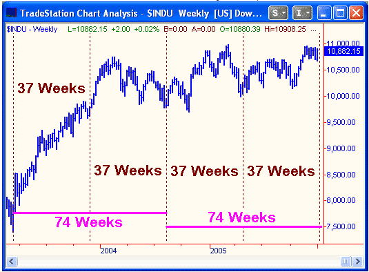
In that May 6th newsletter last year, we depicted the turning points discussed in the April 28th update on a weekly chart rather than a daily one in order to clarify the turns visually. We have done the same thing on todays front-page chart. It is possible for a bull to argue that the market has reached another cycle bottom which could lead to a concerted advance. Based on our technical and cyclical analysis, however, we surmise that a turning point this time around could well turn out to be an important market top. First of all, we would refer you to our newsletter dated November 4th, 2005, where we discuss a 44 month turning point pattern where we reached the conclusion that an important market top could be seen by February 1st, 2006. With the S&P 500 moving to its highest point in over four years and the New York Composite Index moving to a new alltime high within the past few days, it is difficult to argue the market is forming a bottom. If the market is indeed in the process of forming a potentially important top, we can put the front page chart to good use.
George Lindsay, a past cycle master, maintained that virtually every important market top was determined by at least one bottom to bottom to top measurement. In other words, the top would be as far away from a preceding bottom as that bottom was from a bottom preceding it. It may sound complicated but it should be explained far more easily by viewing the front-page chart. At the bottom of the chart there are two horizontal lines that mark 74 week time spans. The first 74 week period is defined by vertical lines at the weeks ending on March 14th, 2003 and August 13th, 2004. That would be a bottom to bottom cycle as defined by Lindsay. If we move forward another 74 weeks from the August 13th, 2004 bottom, it takes us to the week ending January 13th, 2006. If a top is formed within 1-2 weeks of the week ending January 13th, then Lindsays requirement for a bottom to bottom to top count will have been fulfilled once again. Lindsay proclaimed that important market tops often saw more than one bottom to bottom to top configuration. As you can see from the front-page chart, that is also possible because of the 37 week pattern contained therein. That would mean that it is possible that there would be both a 37 week and a 74 week pattern of bottom to bottom equals bottom to top if a top is seen within a week or two of next week.
If we attempt to fine-tune the top based on the longer pattern, the first 74 week period between the March 12th, 2003 bottom and the August 13th, 2004 bottom encompasses 359 trading days. Moving forward 359 trading days from August 13th, 2004, takes us to January 13th, 2006. If we use calendar days to measure the time span, an equal time span forward would take us to Sunday, January 15th. It should be clear the above analysis is alerting us to the possibility that the market is very close to a potentially important turn.
TECHNICAL INDICATORS
We keep looking for ways to convey to subscribers the unprecedented complacency of both investors and investment advisers. The latter group is survey by Investors Intelligence (30 Church St., PO Box 2046, New Rochelle, NY 10801) each week and we tend to give it the most credence because it is the longest consecutive string of sentiment readings that we are aware of and, although they add investment advisers from time to time, their weekly survey is conducted among the same universe of advisers from week to week. There are many ways to analyze the sentiment data from Investors Intelligence. One of the acknowledged techniques is to keep a 10 week moving average of bulls divided by bulls plus bears. When the 10 week moving average reaches 70% or higher there are usually too many bulls to sustain a further advance. There have been periods in history, although quite rare, when the 10 week moving average reaches above the 80% level. It occurred throughout most of 1976 and again in 1986 and 1987. Those were the only periods in the almost 45 year history of the data that saw 10 week moving averages above 80%. In fact, from late 1987 until mid 2003 there was not a single 10 week moving average above 70%. It appears as if the 1987 crash served its purpose in creating fear in the hearts of investors and advisers. That attitude, of course, laid the groundwork for the amazing bull market that began in late 1987 and arose like a Phoenix from the ashes of the 1987 crash.
The amazing aspect of the 1987 crash that many investors and advisers either forgot or never knew was that the 1987 low that followed the crash remained above the low of the preceding year. At that point there had been five consecutive years of higher lows on the Dow Jones Industrial Average. That is the type of long-term bullish behavior that tends to breed complacency among investors and advisers. There indeed was great complacency as the market moved into early October 1987. Perhaps the only way for the market to continue its amazing run to the upside despite the buildup of long term bullish sentiment was a sudden deadly blow to the bullish case. Thats exactly what the crash accomplished in a period of only two weeks. So great was the fear engendered by the crash that the market would advance over the next 13 years without seeing one weekly moving average reading of bulls divided by bulls plus bears above 70%. In fact, the 70% level after 1987 was not reached again until almost 16 years later in June 2003.
A bull could perhaps make the argument that a truly important top in the market will not occur until the 80% level has again been exceeded. The argument must be accorded some respect. On the other hand, there has been an amazingly long string of consecutive weeks without one weekly reading of a plurality of bears over bulls. The latest sentiment report from Investors Intelligence issued on January 4th marked the 168th consecutive week without a single reading showing a plurality of bears over bulls. This string is completely unprecedented in the history of the data. What is perhaps even more striking about the past two-four years of sentiment data is that the market has been so pleasing to advisers that the lowest reading from the 10 week moving average of bulls as a percentage of bulls plus bears over the past two years was 62.5%. To put that reading in perspective we should note that on January 7th, 2000, after an almost uninterrupted 10 year market advance, the 10 week moving average of bulls as a percentage of bulls and bears was 63.9%. That reading was occurring within a week of a Dow top that has held for six years. We are now telling you that there is so much unabashed bullishness that the lowest reading of the past two years has been 62.5%. In other words, bullishness has been so pervasive over the past two years that the lowest 10 week reading matched within 1.4% of the bullish sentiment seen in January 2000 after an unprecedented and virtually uninterrupted advance in the Dow Jones Industrial Average over the prior decade.
Here is yet another sentiment perspective based on the same data. In the two year period between January 1998 and the Dow all-time high in January 2000, the Dow Jones Industrial Average gained 3969 points. The average weekly sentiment reading as calculated by a 10 week moving average of bulls as a percentage of bulls and bears over that two year period was 61.7%. Over the latest two year period ending this past week, the Dow has gained 117 points. In other words it is virtually unchanged over that time. The average weekly bullish reading of a 10 week moving average of bulls as a percentage of bulls and bears over this most recent two year period is 69.3%. To us, that statistic tells the whole story. Theres so much complacency among investment advisers that a market that has been flat for two years has engendered far more bullishness than a market that was up 3969 points over the same period of time. We could be wrong but we believe that this is a lesson that will go down in technical history for decades to come. We repeat our oft-stated maxim that the most bearish sentiment readings are the ones that remain relatively very high in the face of a down to sideways market. We have seen a classic example of that over the past two years. Market history over the next year will be the judge as to how bearish these extremes of bullish sentiment prove to be.
Computers can be magnificent tools for a technician. They can draw trendlines exactly. They can draw perfect parallel channels. A computer spreadsheet can calculate 75 years of daily data in the wink of an eye, data that would have taken days or weeks to calculate prior to the utilization of zeros and ones. One of the things that frustrated us with the market analysis program we had prior to our current one was its inability to construct logarithmic charts. Logarithmic charts can be especially important over longer periods of time or after significant percentage moves by an index or average. Those of you who were subscribers in May 2005 can check the charts on pages 2 and 3 of that issue that contrasted a weekly arithmetic chart of the Nasdaq Composite with a weekly logarithmic chart of that index. Incidentally, despite the recent rally the Nasdaq Composite remains below that broken trendline on the logarithmic chart.
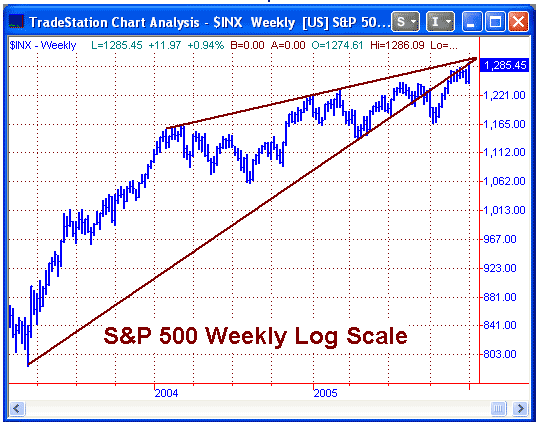
The chart we have included in the current section is a weekly chart of the S&P 500 going back to late 2002 through Friday January 6th, 2006. The price scale is logarithmic and it looks significantly different than its arithmetic brother. Lets first describe the upper and lower trendlines. The legitimacy of the upper trendline is established by hitting the tops of six separate weeks. Those are the weeks ending January 30th, 2004, February 13th, 2004, March 5, 2004, December 31, 2004, and January 7th, 2005. The legitimacy of the lower trendline is established by supporting the price at 5 weekly data points. The first data point is the initiation of the rising bottoms trendline in the week ending March 14th, 2003. From that point it hits almost exact bottoms on April 22nd, 2005, April 29, 2005, May 13, 2005, and July 8, 2005. In the week ending October 7th, 2005, the trendline is convincingly broken. If you view the trendline on an arithmetic chart, the S&P has broken convincingly back above it, theoretically reestablishing a bullish case. The picture you see on the logarithmic charts in this section is a direct move up to the trendline that even included two marginal closes above the trendline but it is obvious that prices are struggling to overcome the resistance of that logarithmic trendline. Perhaps the most bearish characteristic of the chart is that the two trendlines depict a rising wedge formation that the market broke out of to the downside in October. It has now succeeded in rallying back to that trendline with this weeks close almost exactly at the rising trendline once again. At the same time, the price has once again approached the upper trendline which defined the upper segment of the rising wedge formation. A high-volume breakout above these two lines by more than 1-2% could probably reestablish a bullish case. We believe there is a good chance that will not occur, especially based on the pattern discussed in our section on The Cycles. It appears as if some technical and cyclical factors are combining to suggest the possibility of an important top at these levels.
MARKET PROJECTIONS
In our newsletter dated December 2nd, 2005, we noted that the nominal 10 week upside projection for the S&P 500 cash index call for 1,277.39 ± 11 points. The upper window of that projection is at 1,288.39. The high for the S&P this week was todays reading of 1,286.09. On the daily projection charts, a nominal 5 week upside projection was generated on Tuesday and Wednesday of this week and could have been met already although it allows for prices as high as 1,299.75. It appears from all the projection charts that that is currently the highest possible upper window of any projections. Be aware that that number does not have to be reached because all upside projections have been satisfied at least on a minimal basis.
MUTUAL FUNDS
Another calendar year has drawn to a close. It was the first time in the 108 year history of the Dow Jones Industrial Average that a year ending in the digit 5 was a down year. It was down less than 1%, mind you, but down nonetheless. The S&P 500 managed a price gain of 3.0% and a Total Return (which includes all dividends) of 4.91%. Our managed funds eked out a gain of 3.4% for the year, which should equal the price gain for those of you who switch with the Rydex group of funds. We are in the process of consolidating the results from the Fidelity trades and we hope to have those results for you in the next newsletter.
Our new seasonality program which, thanks to Garrett Jones, we are dubbing ESP (Eliades Seasonality Program), continues with its spectacular performance. We began trading it in real time in late February 2005 and after 10 monthly trades, the portfolio is up 28.9% through early January. After two more monthly trades, the first full year of trading the program will be complete.
We have two different specific model portfolios-one for Fidelity select switchers and one for Rydex group switchers. How you distribute your own portfolio is up to you as an individual.
About Peter Eliades


