Running a bond portfolio in a rising interest rate environment is hard. Here are two active managers, Jeffrey Klingelhofer and Nicholos Venditti who have a lot to say. Their honest and sometimes blunt opinions reflect their position in an increasingly difficult market.
Consuelo Mack explores coping mechanisms with the duo on a recent episode of "Wealthtrack" (#1349). Some particular areas of focus: the two levers for bond investment, credit spreads today, the advantage of a laddering strategy, tobacco bonds (why they exist and their outlook), Puerto Rico, and so on. It really is ![]() a Hard-Knock Life...for Bonds
a Hard-Knock Life...for Bonds
http://wealthtrack.c...ement-the-edge/
I first heard of bond ladders in the late 80s, but viewed them only as a means to roll assets in maturing bonds. I particularly liked the explanation in this episode of "Wealthtrack" of how the strategy can work effectively in a rising interest environment. These two bond guys have a passion for their niche, and enthusiasm for finding ways to serve their clients.
I realize this interview may not get a lot of attention on a website devoted primarily to equities and shorter term holding periods, but it might stretch your horizons a bit. I believe the insight from the interchange will be worth the viewing/listening time. -- Alton

It's a Hard-Knock Life... for Bonds
#1

Posted 09 July 2017 - 09:03 PM
#2

Posted 09 July 2018 - 10:19 PM
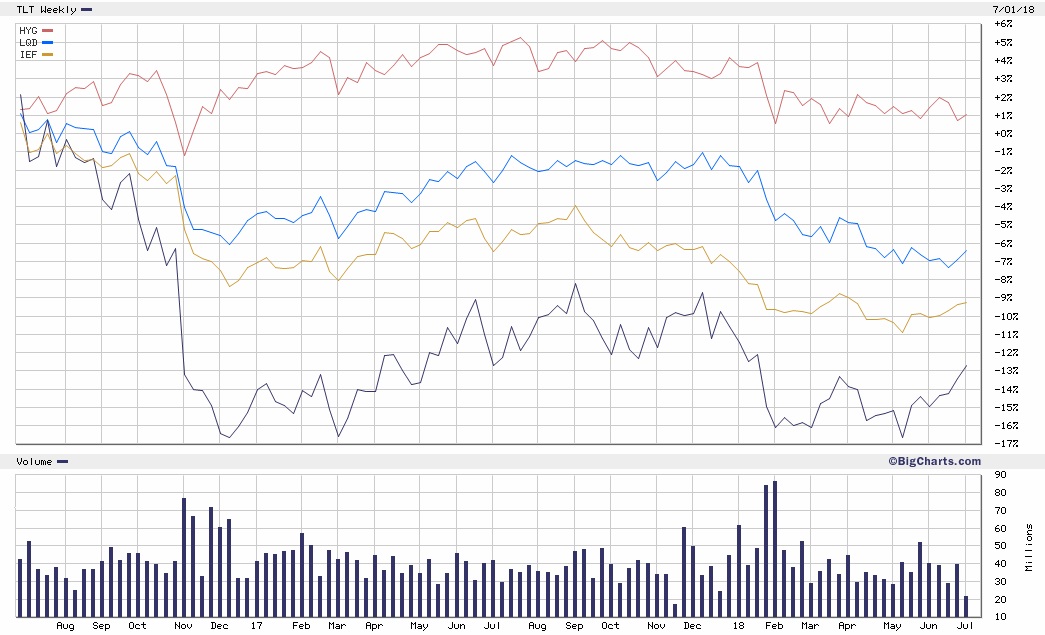
Designating a date for the “top” of the bond market depends on what you’re following. I remember hearing bond “warnings” when the Fed hinted they would slow the pace of quantitative easing, long before they actually began raising rates. Here we are, some years later with the damage depending on where your money (or interest) is. The twenty-year U.S. Treasury peaked in early July of 2016, two years ago, and that’s my reference period.
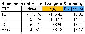
The chart (and table) displayed here includes iShares ETFs representing four bond benchmarks. TLT tracks the Twenty-year bond. IEF includes T-Notes in the 7-10 year span. Investment-grade corporate bonds are represented by LQD. And HYG is the ETF for High-yield (but somewhat lower grade) corporate bonds. The corporate issues are to my knowledge, all U.S. based.
The table shows metrics for these four ETFs over the two-year span (July 1, 2016 to July 6, 2018). The column headed d(%) is simply the percent change in the ETF price in the two-year period. The difference in dollars over the same period is d($). The column heading Div$Adjust represents the adjustment in price for dividends distributed by each ETF during the two-year span. This amount is not considered or included in the percentage or dollar gain (loss) columns and may prompt you to add another column to the table.

I wrote, then deleted a paragraph describing what the chart says to me. But members and readers here are well versed in chart interpretation, and your opinion is most valid for your situation.
Depending on how you’be been invested you may feel the period has been fairly complacent. Although tightening is underway, it seems to me the Fed has been snugging carefully so far. I don’t anticipate any impending change in this approach, but if they feel the need to take an aggressive approach, an impression of complacency may ill-advised. I’m reminded of the antiquated joke about the optimist who fell from the Railway Exchange Building. As he passed the 7th floor, he called out, “So far, so good.”
Giving credit: Yahoo Finance provided historical prices for the table. The ETFs mentioned are iShares products. The comparison chart was made using BigCharts, one of the webs early free charting services. I have no positions in the ETFs mentioned or their equivalent or inverse issues.


